
import pandas as pdimport numpy as npimport matplotlib.pyplot as pltimport seaborn as snssns.set_style('whitegrid')plt.style.use("fivethirtyeight")%matplotlib inline# For reading stock data from yahoofrom pandas_datareader.data import DataReaderimport yfinance as yffrom pandas_datareader import data as pdryf.pdr_override()# For time stampsfrom datetime import datetime# The tech stocks we'll use for this analysistech_list = ['AAPL', 'GOOG', 'MSFT', 'AMZN']# Set up End and Start times for data grabtech_list = ['AAPL', 'GOOG', 'MSFT', 'AMZN']end = datetime.now()start = datetime(end.year - 1, end.month, end.day)for stock in tech_list:globals()[stock] = yf.download(stock, start, end)company_list = [AAPL, GOOG, MSFT, AMZN]company_name = ["APPLE", "GOOGLE", "MICROSOFT", "AMAZON"]for company, com_name in zip(company_list, company_name):company["company_name"] = com_namedf = pd.concat(company_list, axis=0)df.tail(10)
[*********************100%%**********************]  1 of 1 completed
[*********************100%%**********************]  1 of 1 completed
[*********************100%%**********************]  1 of 1 completed
[*********************100%%**********************]  1 of 1 completed
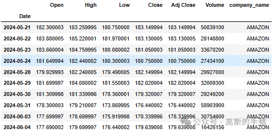
# Summary StatsAAPL.describe()
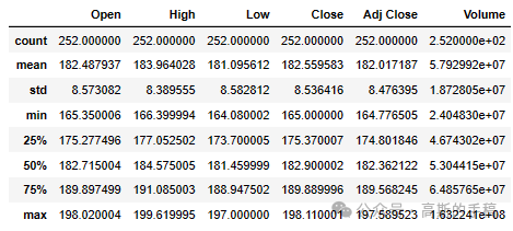
# General infoAAPL.info()
<class 'pandas.core.frame.DataFrame'>
DatetimeIndex: 252 entries, 2023-06-05 to 2024-06-04
Data columns (total 7 columns):
 #   Column        Non-Null Count  Dtype
---  ------        --------------  -----
 0   Open          252 non-null    float64
 1   High          252 non-null    float64
 2   Low           252 non-null    float64
 3   Close         252 non-null    float64
 4   Adj Close     252 non-null    float64
 5   Volume        252 non-null    int64
 6   company_name  252 non-null    object
dtypes: float64(5), int64(1), object(1)
memory usage: 15.8+ KB
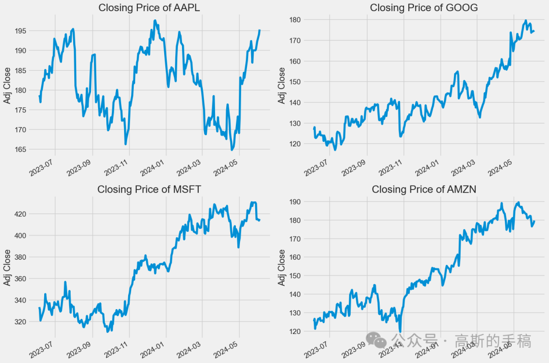
# Let's see a historical view of the closing priceplt.figure(figsize=(15, 10))plt.subplots_adjust(top=1.25, bottom=1.2)for i, company in enumerate(company_list, 1):plt.subplot(2, 2, i)company['Adj Close'].plot()plt.ylabel('Adj Close')plt.xlabel(None)plt.title(f"Closing Price of {tech_list[i - 1]}")plt.tight_layout()
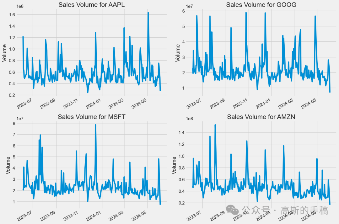
# Now let's plot the total volume of stock being traded each dayplt.figure(figsize=(15, 10))plt.subplots_adjust(top=1.25, bottom=1.2)for i, company in enumerate(company_list, 1):plt.subplot(2, 2, i)company['Volume'].plot()plt.ylabel('Volume')plt.xlabel(None)plt.title(f"Sales Volume for {tech_list[i - 1]}")plt.tight_layout()
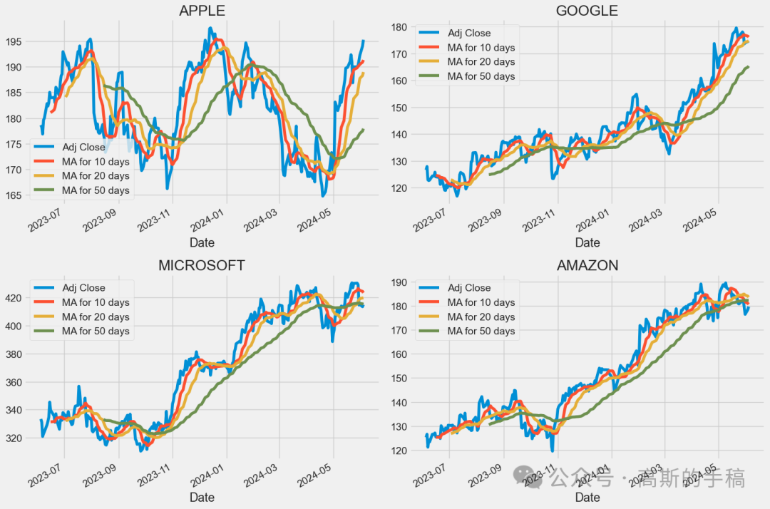
ma_day = [10, 20, 50]for ma in ma_day:for company in company_list:column_name = f"MA for {ma} days"company[column_name] = company['Adj Close'].rolling(ma).mean()fig, axes = plt.subplots(nrows=2, ncols=2)fig.set_figheight(10)fig.set_figwidth(15)AAPL[['Adj Close', 'MA for 10 days', 'MA for 20 days', 'MA for 50 days']].plot(ax=axes[0,0])axes[0,0].set_title('APPLE')GOOG[['Adj Close', 'MA for 10 days', 'MA for 20 days', 'MA for 50 days']].plot(ax=axes[0,1])axes[0,1].set_title('GOOGLE')MSFT[['Adj Close', 'MA for 10 days', 'MA for 20 days', 'MA for 50 days']].plot(ax=axes[1,0])axes[1,0].set_title('MICROSOFT')AMZN[['Adj Close', 'MA for 10 days', 'MA for 20 days', 'MA for 50 days']].plot(ax=axes[1,1])axes[1,1].set_title('AMAZON')fig.tight_layout()
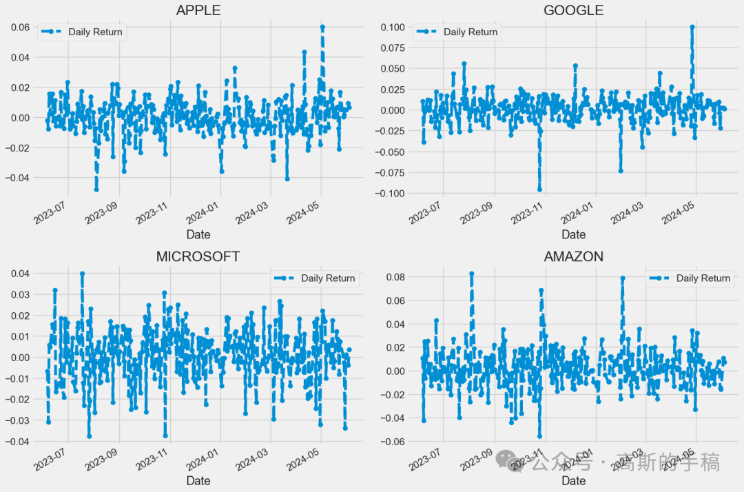
# We'll use pct_change to find the percent change for each dayfor company in company_list:company['Daily Return'] = company['Adj Close'].pct_change()# Then we'll plot the daily return percentagefig, axes = plt.subplots(nrows=2, ncols=2)fig.set_figheight(10)fig.set_figwidth(15)AAPL['Daily Return'].plot(ax=axes[0,0], legend=True, linestyle='--', marker='o')axes[0,0].set_title('APPLE')GOOG['Daily Return'].plot(ax=axes[0,1], legend=True, linestyle='--', marker='o')axes[0,1].set_title('GOOGLE')MSFT['Daily Return'].plot(ax=axes[1,0], legend=True, linestyle='--', marker='o')axes[1,0].set_title('MICROSOFT')AMZN['Daily Return'].plot(ax=axes[1,1], legend=True, linestyle='--', marker='o')axes[1,1].set_title('AMAZON')fig.tight_layout()
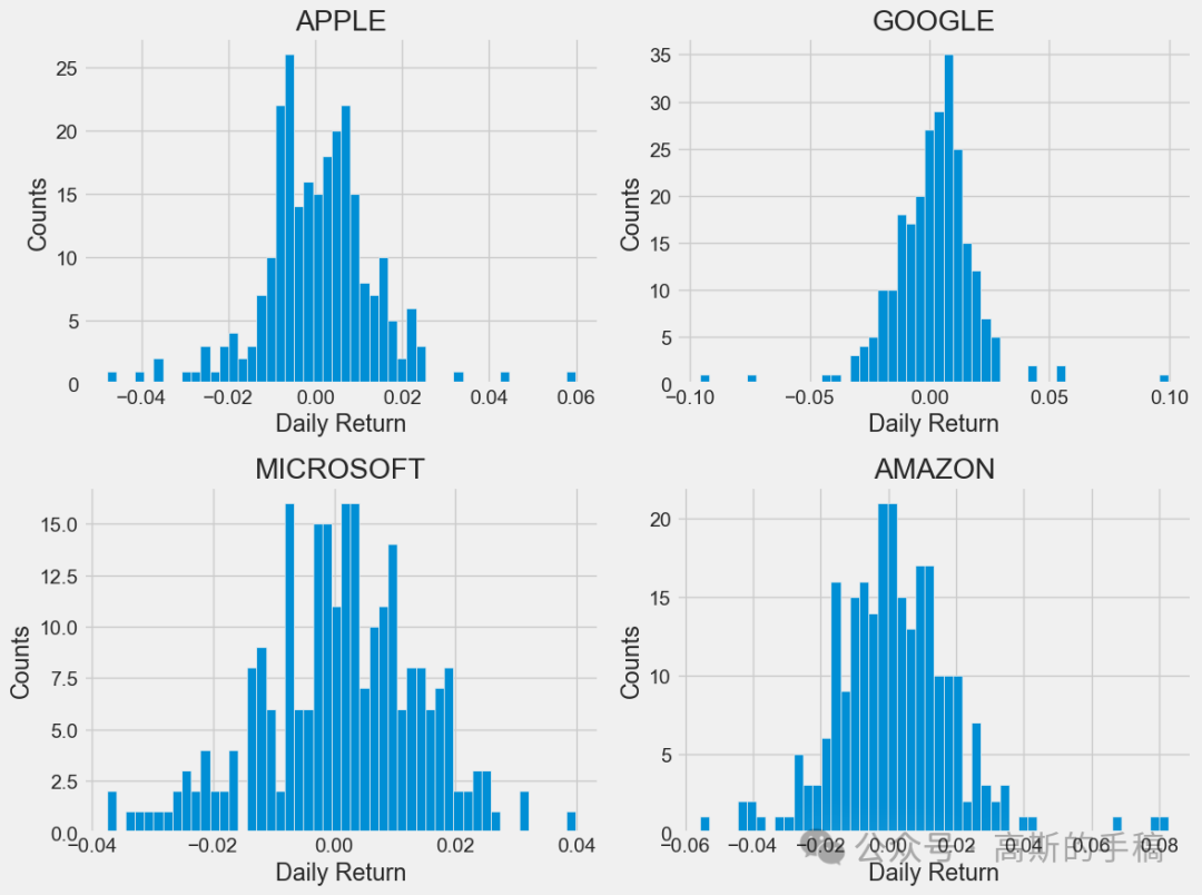
plt.figure(figsize=(12, 9))for i, company in enumerate(company_list, 1):plt.subplot(2, 2, i)company['Daily Return'].hist(bins=50)plt.xlabel('Daily Return')plt.ylabel('Counts')plt.title(f'{company_name[i - 1]}')plt.tight_layout()
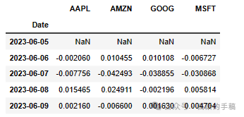
# Grab all the closing prices for the tech stock list into one DataFrameclosing_df = pdr.get_data_yahoo(tech_list, start=start, end=end)['Adj Close']# Make a new tech returns DataFrametech_rets = closing_df.pct_change()tech_rets.head()
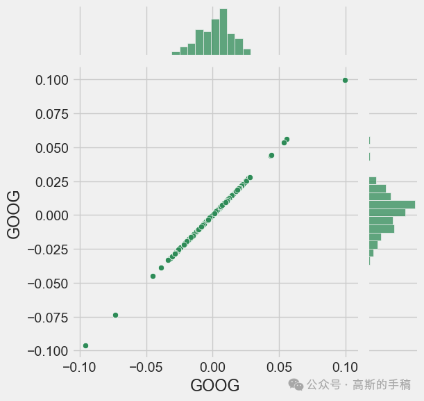
# Comparing Google to itself should show a perfectly linear relationshipsns.jointplot(x='GOOG', y='GOOG', data=tech_rets, kind='scatter', color='seagreen')
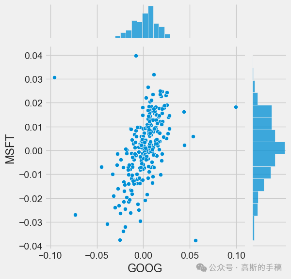
# We'll use joinplot to compare the daily returns of Google and Microsoftsns.jointplot(x='GOOG', y='MSFT', data=tech_rets, kind='scatter')
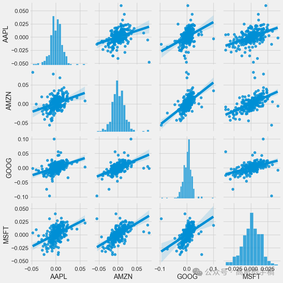
# We can simply call pairplot on our DataFrame for an automatic visual analysis# of all the comparisonssns.pairplot(tech_rets, kind='reg')
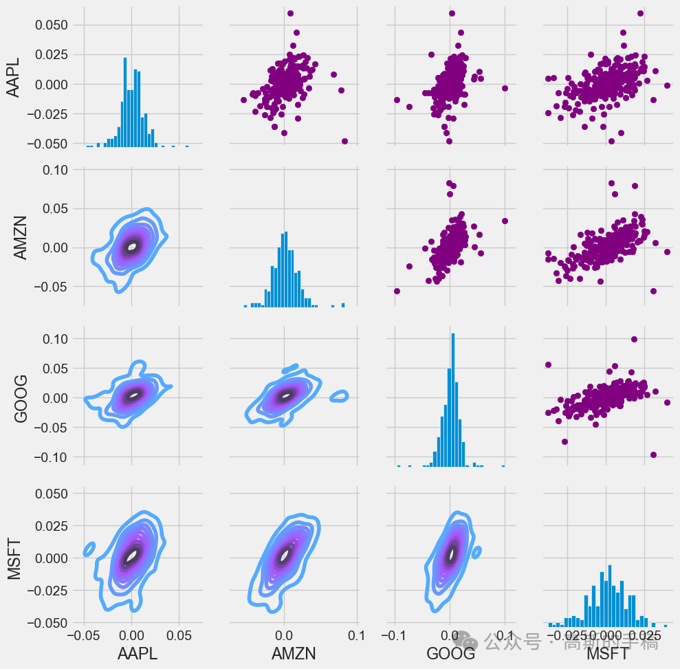
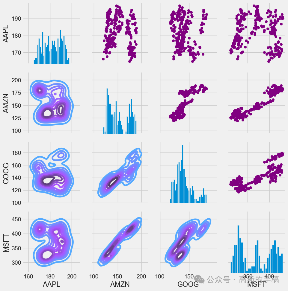
# Set up our figure by naming it returns_fig, call PairPLot on the DataFramereturn_fig = sns.PairGrid(tech_rets.dropna())# Using map_upper we can specify what the upper triangle will look like.return_fig.map_upper(plt.scatter, color='purple')# We can also define the lower triangle in the figure, inclufing the plot type (kde)# or the color map (BluePurple)return_fig.map_lower(sns.kdeplot, cmap='cool_d')# Finally we'll define the diagonal as a series of histogram plots of the daily returnreturn_fig.map_diag(plt.hist, bins=30)
# Set up our figure by naming it returns_fig, call PairPLot on the DataFramereturns_fig = sns.PairGrid(closing_df)# Using map_upper we can specify what the upper triangle will look like.returns_fig.map_upper(plt.scatter,color='purple')# We can also define the lower triangle in the figure, inclufing the plot type (kde) or the color map (BluePurple)returns_fig.map_lower(sns.kdeplot,cmap='cool_d')# Finally we'll define the diagonal as a series of histogram plots of the daily returnreturns_fig.map_diag(plt.hist,bins=30)
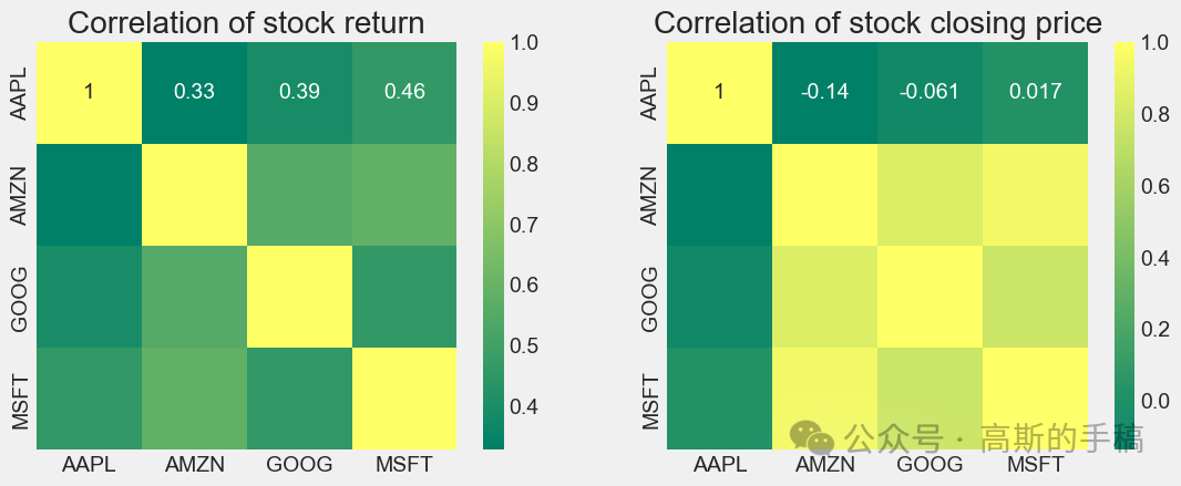
plt.figure(figsize=(12, 10))plt.subplot(2, 2, 1)sns.heatmap(tech_rets.corr(), annot=True, cmap='summer')plt.title('Correlation of stock return')plt.subplot(2, 2, 2)sns.heatmap(closing_df.corr(), annot=True, cmap='summer')plt.title('Correlation of stock closing price')
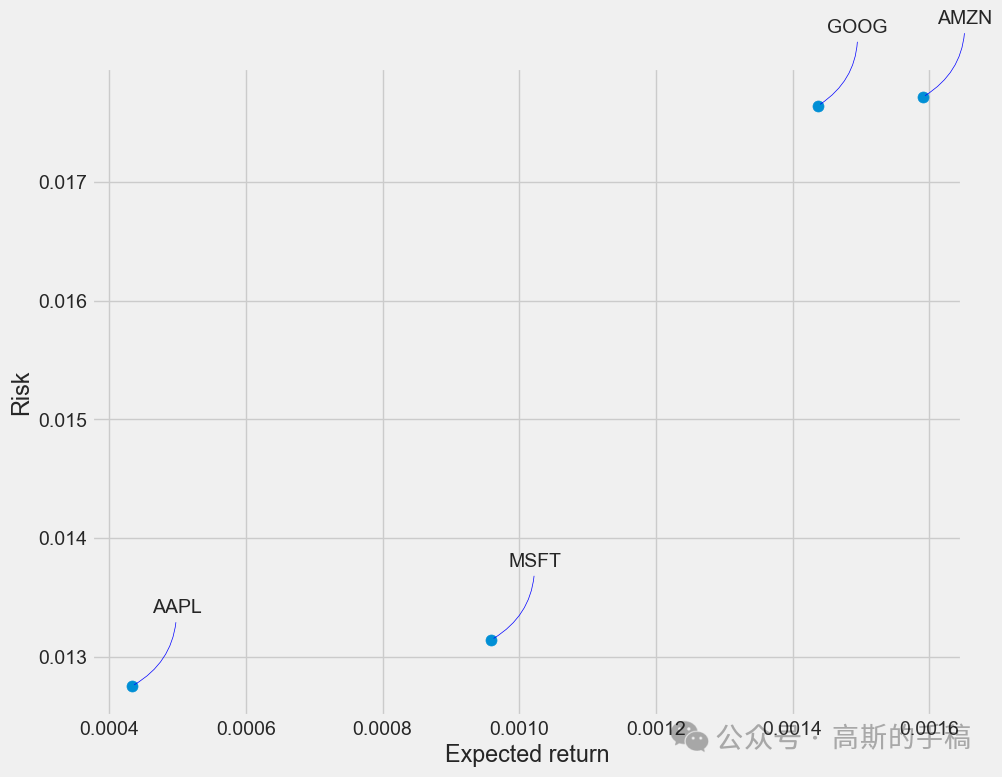
rets = tech_rets.dropna()area = np.pi * 20plt.figure(figsize=(10, 8))plt.scatter(rets.mean(), rets.std(), s=area)plt.xlabel('Expected return')plt.ylabel('Risk')for label, x, y in zip(rets.columns, rets.mean(), rets.std()):plt.annotate(label, xy=(x, y), xytext=(50, 50), textcoords='offset points', ha='right', va='bottom',arrowprops=dict(arrowstyle='-', color='blue', connectionstyle='arc3,rad=-0.3'))
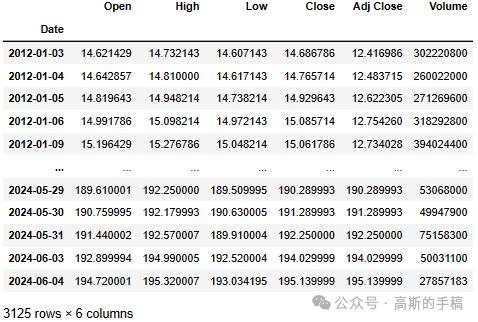
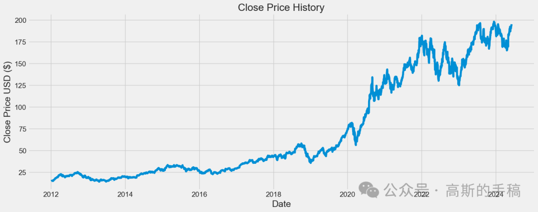
# Get the stock quotedf = pdr.get_data_yahoo('AAPL', start='2012-01-01', end=datetime.now())# Show teh datadf
plt.figure(figsize=(16,6))plt.title('Close Price History')plt.plot(df['Close'])plt.xlabel('Date', fontsize=18)plt.ylabel('Close Price USD ($)', fontsize=18)plt.show()
# Create a new dataframe with only the 'Close columndata = df.filter(['Close'])# Convert the dataframe to a numpy arraydataset = data.values# Get the number of rows to train the model ontraining_data_len = int(np.ceil( len(dataset) * .95 ))training_data_len
2969
# Scale the datafrom sklearn.preprocessing import MinMaxScalerscaler = MinMaxScaler(feature_range=(0,1))scaled_data = scaler.fit_transform(dataset)scaled_data
array([[0.00401431],
       [0.00444289],
       [0.00533302],
       ...,
       [0.96818027],
       [0.97784564],
       [0.98387293]])
# Create the training data set# Create the scaled training data settrain_data = scaled_data[0:int(training_data_len), :]# Split the data into x_train and y_train data setsx_train = []y_train = []for i in range(60, len(train_data)):x_train.append(train_data[i-60:i, 0])y_train.append(train_data[i, 0])if i<= 61:print(x_train)print(y_train)print()# Convert the x_train and y_train to numpy arraysx_train, y_train = np.array(x_train), np.array(y_train)# Reshape the datax_train = np.reshape(x_train, (x_train.shape[0], x_train.shape[1], 1))# x_train.shape
from keras.models import Sequentialfrom keras.layers import Dense, LSTM# Build the LSTM modelmodel = Sequential()model.add(LSTM(128, return_sequences=True, input_shape= (x_train.shape[1], 1)))model.add(LSTM(64, return_sequences=False))model.add(Dense(25))model.add(Dense(1))# Compile the modelmodel.compile(optimizer='adam', loss='mean_squared_error')# Train the modelmodel.fit(x_train, y_train, batch_size=1, epochs=1)
# Create the testing data set# Create a new array containing scaled values from index 1543 to 2002test_data = scaled_data[training_data_len - 60: , :]# Create the data sets x_test and y_testx_test = []y_test = dataset[training_data_len:, :]for i in range(60, len(test_data)):x_test.append(test_data[i-60:i, 0])# Convert the data to a numpy arrayx_test = np.array(x_test)# Reshape the datax_test = np.reshape(x_test, (x_test.shape[0], x_test.shape[1], 1 ))# Get the models predicted price valuespredictions = model.predict(x_test)predictions = scaler.inverse_transform(predictions)# Get the root mean squared error (RMSE)rmse = np.sqrt(np.mean(((predictions - y_test) ** 2)))rmse
10.469761767631676
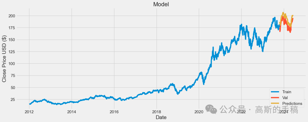
# Plot the datatrain = data[:training_data_len]valid = data[training_data_len:]valid['Predictions'] = predictions# Visualize the dataplt.figure(figsize=(16,6))plt.title('Model')plt.xlabel('Date', fontsize=18)plt.ylabel('Close Price USD ($)', fontsize=18)plt.plot(train['Close'])plt.plot(valid[['Close', 'Predictions']])plt.legend(['Train', 'Val', 'Predictions'], loc='lower right')plt.show()
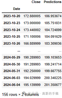
# Show the valid and predicted pricesvalid
发布者:股市刺客,转载请注明出处:https://www.95sca.cn/archives/111153
站内所有文章皆来自网络转载或读者投稿,请勿用于商业用途。如有侵权、不妥之处,请联系站长并出示版权证明以便删除。敬请谅解!


