
import plotly.express as px
import plotly.graph_objects as go
df = px.data.gapminder()
df = df.loc[df["country"].isin(
[
'Germany',
'United Kingdom',
'Finland',
'Belgium',
'Sweden',
'Denmark',
'Austria',
'Iceland',
'Netherlands',
'Switzerland',
'Ireland',
'Norway'
]
)
]
df["country_index"] = df.groupby("year")["country"].cumcount()
df = df.sort_values(["year", "gdpPercap"], ignore_index=True)
df["showlegend"] = df.groupby("country")["year"].cumcount() == 0
colors = px.colors.qualitative.Alphabet
fig = go.Figure()
for index, row in df.iterrows():
fig.add_trace(
go.Bar(
y=[row["year"]],
x=[row["pop"]],
customdata=[row["gdpPercap"]],
hovertemplate="%{x:2f}, GDP per capita: %{customdata:2f}",
marker=dict(color=colors[row["country_index"]]),
name=row["country"],
legendgroup=row["country"],
showlegend=row["showlegend"],
orientation="h"
)
)
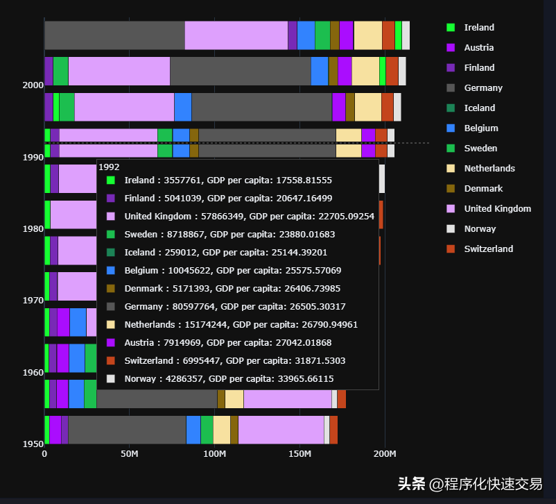
fig.update_layout(barmode="stack", hovermode="y unified",template ='plotly_dark',width = 800,height = 800)输出图形如下:
图1:
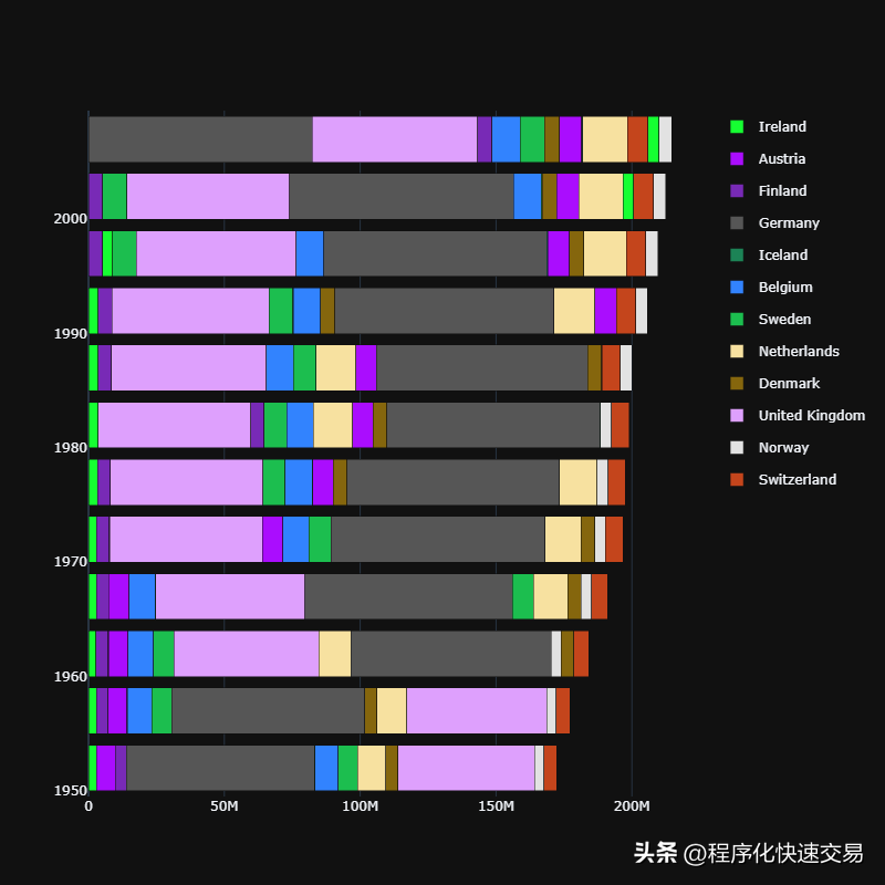

图2:
发布者:股市刺客,转载请注明出处:https://www.95sca.cn/archives/73797
站内所有文章皆来自网络转载或读者投稿,请勿用于商业用途。如有侵权、不妥之处,请联系站长并出示版权证明以便删除。敬请谅解!